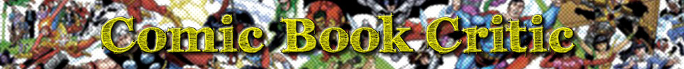
Grimm Fairy Tales Presents:
Robyn Hood #2 (of 5) Review
 Writer: Pat Shand
Pencils: Larry Watts
Colorist: Andrew Elder
Letterer: Jim Campbell
Cover Art: Ale Garza & JJ Kirby (Cover A)
Editor: Hannah Gorfinkel
Publisher: Zenescope
Cover Date: Oct 2012
Cover Price: $2.99

Title: Grimm Fairy Tales Presents: Robyn Hood
We’re back with the second installment of Robyn Hood by Zenescope and writer Pat Shand has once again delivered. I found this book to be a wonderful compliment to the first issue where, not only did we get some action, the setup was done really well. Issue #2 continues to delve into Robyn’s past, without distracting from what’s happening in the ‘here and now’.
Shand does a tremendous job flipping back and forth between flashbacks by integrating the dialogue so you really get a feel that Robyn has, in some ways, been through this before. We all have those moments of deja vu where a situation almost mirrors one from our past, albeit not always as severe. When reading Robyn’s tale, you really get a sense that she’s not over compensating for something that happened to her as a child. She’s had a rough go at it and the people confronting her are clueless to the fact that they are handing her reasons to go on an arrow flinging, eye stabbing rampage.
The Dialogue:
I’ve always wished people in comic books would act their age. Certain characters, its understandable and accepted that they are wise beyond their years (Bruce Wayne) or they are overly bratty (Damian Wayne). I think Robyn’s dialogue is right on par with who she is and what she’s been through. She’s a no nonsense kind of gal and she’s not afraid to silence that kind of noise because she get’s ‘bored pretty quickly’. She’s a girl of today in a world that parallels one we haven’t seen in over 600 years. I really enjoyed the way she mixed words with knights, lords, peasants and water. Yes, she spoke to water (read it and you’ll see why it makes sense).
There were good exchanges between characters within this issue and a few that made me laugh, whether they were intended to or not. The characters, through their dialogue, stay within themselves and do not step away from who they are by using a different voice when speaking. As an additional note, Robyn’s internal dialogue also holds value as it segues into what’s being said in real-time.
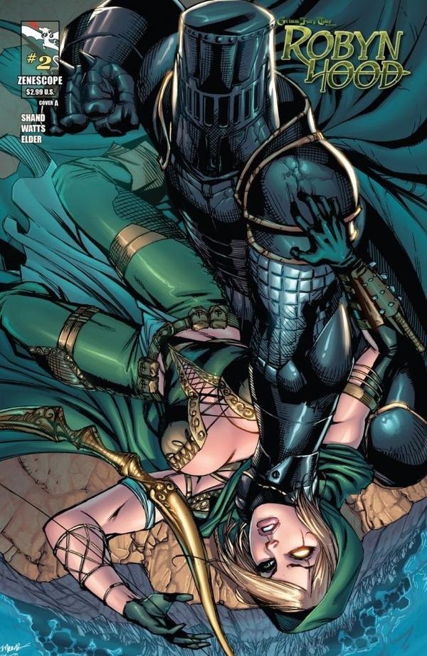
The Art:
This month the artist for the interiors is Larry Watts. I’m not entirely sure why they jumped to another artist already because I really enjoyed the work Dan Glasl did in the first issue. This isn’t a step forward (or a step back for that matter), instead it’s a lateral move with a different style. The step back are the colors. Last month Tom Mullin and Jason Embury provided us with crisp, vibrant colors that really made the images come to life.
Issue 2 of Robyn Hood has Andrew Elder using a more dull color scheme which is nice, but doesn’t make any of the visuals ‘pop’. Comic books are equal parts visual as they are literary and if the pages aren’t vying for my attention then it ruins the overall experience for me. I’m not implying that the art was horrible, because they would take me to the woodshed in a head-to-head matchup so I’ll never call the kettle black here.
What I am saying is that the comic book experience is that of reading and seeing the story develop, panel by panel. Several times I caught myself reading more and seeing less. It wasn’t until I went through the book a second time to really study the pictures as the story had me so drawn in, I didn’t notice much the first time around. Stop and look at the art, it’s well done…it just doesn’t pull you in.
 BullsEYE! (comixology.com)
What I Loved:
The integration of a modern day girl in a land of Renaissance is not lost during the creative process. There are little hints reminding you that Robyn is out of her element in this world. We’ve seen that she’s come from a downtrodden lifestyle where money was scarce and her choices in clothing were limited. Often, she wears the same thing in flashbacks, which leads me to believe that this is a calculated move to show how poor she was, not just careless abandon on the creative side. It’s these kind of details that really make a book enjoyable.
A lot of readers have ruined good books as they pick apart inconsistencies (through no fault of their own) instead of enjoying the ride. This series has been good at telling all parts of Robyn’s story without calling attention to every little thing. It’s one thing to say “Robyn was poor and therefore didn’t have many outfits, which the kids at school would tease her about.” And another thing entirely to just show it in the imagery to let the reader see it with his own eyes and draw the conclusion.
What I Hated:
Because it’s a mini-series of 5 issues, I don’t understand the need for two different art teams in as many issues. Zenescope isn’t the first company to do this, and I’m sure they won’t be the last, but since the review is about Robyn Hood #2 that’s where my grief is targeted. Have you ever thought of turning on the Simpson’s on Sunday night only to discover that this week’s episode was drawn by Trey Parker and Matt Stone from South Park? Wouldn’t that be a bit distracting?
Yes, even the best comic books have guest artists or change the creative teams with a degree of frequency but this is a 5 issue miniseries. What’s happening that they can’t (or won’t) commit to a team of artists for 5 straight books? It’s distracting and a bit of a let down when I enjoyed the style in issue 1 only to discover that visually the book has changed. I pray that I don’t wake up some Saturday morning to discover that Teenage Mutant Ninja Turtles has guest animation from the Winx Club team.

Favorite (Non-Spoilerish) Line:
“I’m Robyn. Nice to meet you. Now piss off and leave the girl alone.” Robyn makes it known she’s not to be taken lightly.
In Conclusion:
Once again this series has delivered. While the inconsistency at pencils and colors from the first issue may distract a bit, they still deliver quality work. I’ve heard through the social circles that people want this to be an ongoing, but I disagree. This is the type of book that works well as a mini-series and with the right support from readers like you, we could easily get a second volume with a whole new story. A sequel of some sort, but one that could still stand alone on its own merits.
I like that there will be an ending and readers will get closure and perhaps at some point a new story will emerge down the line. For now, Robyn Hood is likeable, in a dark sort of way, giving readers a no-nonsense female lead who has good motivation for her cause.
Stephen J. Mitchell has been reading comic books since the early 90’s and recently has introduced his children to the world of comics. He feels that comic books have evolved to a place in literature where anyone should be able to read one without being stereotyped. Follow him on Twitter!
Credits:
Cover image courtesy of comicvine.com
“BullsEYE” image courtesy of comixology.com
Raphael image courtesy of nick.com