New DC Entertainment Logos in Full Color!

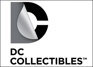
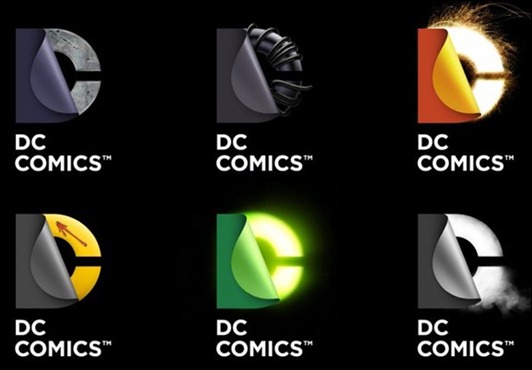
Last week it was revealed that DC Entertainment was getting rid of the “swoosh” logo in favor of a newer, more modern look. The new “peel away” logo was quickly dismissed by many as ugly, plain and generic. Well, today, DC officially announced their “new brand identity” along with some examples and uses of their logo, which is based on the appropriately named Gotham font.
While I was one of those who hated the original design, which turned out to just be a template, I can tolerate the examples that DC has provided. I still don’t really quite like the new sleeker look entirely, but it looks much better then the basic design in black and white.
Take a look at the designs below and let us know what you think. You can also take our poll over on the right sidebar. —->
Read more
