New DC Entertainment Logos?
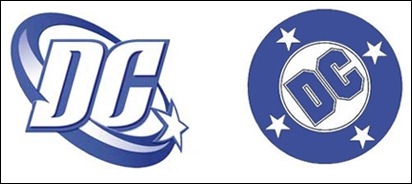
Warner Bros. has applied for a trademark on a new logo for both DC Comics and DC Entertainment. The logo, which looks like a pulled or flipped back letter D sticker exposing the letter C, may be replacing the current swoosh logo that was introduced in 2005. The swoosh logo had replaced the popular DC bullet design that was introduced back in 1976.
The trademark on the new “sticker” logo was applied for in black and white. According to the trademark, “Color is not claimed as a feature of the mark. The mark consists of the letter “D” flipping back to reveal the letter “C” and DC ENTERTAINMENT.”
Even though the swoosh logo never seemed to gain as much popularity as the classic bullet design, eventually it became more visible due to its placement in the opening credits to major DC films such Christopher Nolan’s Batman franchise. The new logo seems very austere and sanitized compared to their previous logo designs.
The new peel back logo has a very generic feel to it and even after color is applied, it will still have that same plain look about it. I just don’t see many people wearing clothing or hats with the new logo on it, no matter what the color scheme will be.
What do you think about the new logo? Cast your vote in the poll on our right sidebar and leave us a comment!
Update 01/16/12
Here are higher resolution images of the logos courtesy of BleedingCool.com. They look even more generic, lifeless, and sanitized but BIGGER!
– The Comic Book Critic


